
EasyPlot is a simple Haskell library for drawing graphs. I wouldn’t call them beautiful by any stretch, but it’s excellent for quick-and-dirty visualizations. The main appeal is being able to use idiomatic tricks like list comprehensions: define a set of tuples, and Haskell will get you all points in that set.
However, lots of people have encountered hitches to installing it (at least in Windows). Worse, most online resources only say how to install it on Linux, which is super-easy. Here, I just want to spell everything out, since even though it’s not super-fancy, you can still do some fun things with EasyPlot.
Installing in Windows
EasyPlot is based on gnuplot, a fairly retro program dating back to the ’80s. Interestingly, the open-source econometrics package Gretl uses gnuplot. You can install it by downloading a nice .exe file, which makes everything easy. The most recent version (currently 5.2.8) worked fine for me.
With this installed, the first hitch is that you need to update your %PATH% variable, so that your computer can find the file. In Windows 10, you can just put “environment variables” in the searchbar. The longer way is: Control Panel > System and Security > System > Advanced System Settings.
Click on the button that says ‘Environment Variables’. Under ‘System Variables’ there should be one called Path. Highlight it, click ‘Edit’, click ‘New’, and add the folder that gnuplot.exe is in. For me, it’s: C:\Program Files\gnuplot\bin. Then click OK, OK, OK, and we’re done that part.
Then we need to install it on Haskell. For 8.10.2, putting cabal new-install easyplot in the command line worked for me. For 8.6.5, I needed to use the older cabal install easyplot.
There’s a very similar package gnuplot, which you can install too if you want. The hitch with this is that it keeps throwing an error message asking for pgnuplot, which is deprecated. To fix this, you just need to make a copy of gnuplot.exe and name it pgnuplot.exe. The syntax for Gnuplot is very similar, but far more customizable. Let’s leave that aside for now.
If EasyPlot is installed correctly, you should be able to import Graphics.EasyPlot from GHCi or WinGHCi. If it’s still not working, try using stack install easyplot or cabal new-install easyplot.
The second hitch is actually using it. The documentation kindly offers some example plots, but they don’t work in Windows without some editing. Let’s take one example:
plot X11 $ Function2D [Title "Sine and Cosine"] [] (\x -> sin x * cos x)
First, X11 specifies that it’s meant for Linux, so for Windows we need to change this to Windows, or for Mac change it to Aqua. However, if we put this into the terminal, our chart pops up for a split second, then erases, leaving behind True to show that it ‘worked’.
The solution, thanks to the mailing list, is to enclose our plot in a monad, namely a do statement. This makes sense if you’re vaguely familiar with monads, since making a plot is an IO action.
Next, instead of plot we have to use plot' [Interactive]. Here’s a version that will actually work:
do plot' [Interactive] Windows $ Function2D [Title "Sine * Cosine"] [] (\x -> sin x * cos x)
Here, [Interactive] specifies that we want a window we can adjust. This is quite nice, actually: we just resize the window and the diagram stretches and shrinks along with it.
Alternatively, if we want to print out an image we use the following syntax:
do plot (PNG "test.png") $ Gnuplot2D [Color Blue] [] "2**cos(x)"
Note that we’re using plot with no apostrophe, and that we’re replacing [Interactive] Windows. It can also make PDFs (like so: (PDF "test.pdf")), which are vector images, so won’t get blurry if you zoom in on them. Still, since EasyPlot doesn’t let you set the axes beforehand (and the printed PNG often looks coarser), most of the time I’d rather adjust the window by hand and take a screenshot.
One last hitch, and this is a weird one. Suppose we save one of our plots to a variable, like so:
test = do plot' [Interactive] Windows $ Gnuplot2D [Color Blue] [] "2**cos(x)"
Then when we put test into the terminal, it makes the plot we want, but the next line looks like this:
gnuplot >
This happens because Haskell is calling the program gnuplot, and hasn’t left that program yet. So you need to manually type quit in the terminal. Once you know you have to do this, it’s easy enough, but it also means you can’t make automated plots, which is a drag. Furthermore, if you’re doing this on WinGHCi it doesn’t even show the gnuplot > line, so it’s even more confusing.
All that was a huge pain to figure out, but from there everything else is easy. Wahey! Now let’s go on to see some examples of stuff we can make.
EasyPlot Examples
Here are some EasyPlot examples I found on various sites in French, Spanish, and Russian(!).
First, here’s one I made of a logarithmic spiral (where you can save the code as spiralplot.hs):
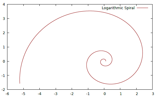
module SpiralPlot where
import Graphics.EasyPlot

spiral = [(x,y) | t <- [0,0.01..4],
        let x = a * exp t * cos (b*t),
        let y = a * exp t * sin (b*t)]
        where a = 0.1 ; b = 4

main = do plot' [Interactive] Windows $ Data2D [Title "Logarithmic Spiral", Style Lines] [] spiral
For the parameters we can also pattern-match like where (a,b) = (0.1,4), but as such it’s fine. Another example here (code) plots radioactive decay; just don’t forget to change the plot X11 part.
The main drawback is that functions need to be expressed explicitly in the form z = f(x,y) or y = f(x) (i.e. the dependent variable can’t be part of the equation), while apparently other math software lets you plot implicit functions like \(\sin(y^2 * x^3) = \cos(y^3 * x^2)\). A cool project might be to write a program that makes an implicit function into an explicit one and feeds it into EasyPlot.
3D Plots
Next, here’s a 3D plot from the documentation:
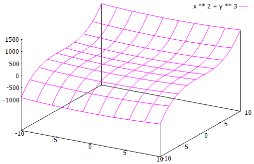
do plot' [Interactive] Windows $ Gnuplot3D [Color Magenta] [] "x ** 2 + y ** 3"
This is where EasyPlot shines relative to other software; in TikZ this would probably take hours to do. Judging from a quick search, it’s possible with gnuplot to color in the mesh, making it even snazzier.
Calculus
One user on a French forum wanted to know if we can diagram Taylor polynomials without formally using calculus in Haskell. That is, we want to approximate an equation using its Taylor expansion:
\[T_{n,0}(x) = \frac{x^0}{0!}\cdot f^{(0)}(0) + \frac{x^1}{1!}\cdot f^{(1)}(0) + \frac{x^2}{2!}\cdot f^{(2)}(0) + \cdots\]
To do this, we’ll create two infinite lists: one for \(\left[ \frac{x^0}{0!}, \frac{x^1}{1!}, \frac{x^2}{2!}, \cdots \right]\) and one for \(\left[ f^{(0)}(0), f^{(1)}(0), \cdots \right]\).
The idea is to graph both the true function and its approximation, showing how the latter becomes better as our Taylor polynomial increases in degree. This is how it’s supposed to look like:
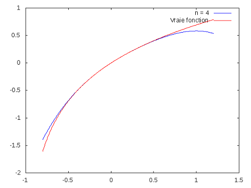
However, I can’t get it working. My best guess is, it’s because of either polyTaylor (snd tf) n or fst tf, or both. I played around with it, but no luck. Below I’ll put a translated version of the code, and if anyone is able to fix it, do let me know. I’ll make a StackExchange question about this problem later.
module TaylorPolynomials where
import Graphics.EasyPlot

-- Returns the vector [1, x, x^2/2!, x^3/3!, ..]
vecTaylor :: Double -> [Double]
vecTaylor    x      =  scanl (\ acc k -> acc * x / k) 1.0 [1 .. ]

-- Basic functions
-- fonction :: Double -> Double
invPlus  = (\ x -> 1 / (1 + x))
invMinus = (\ x -> 1 / (1 - x))
logPlus  = (\ x -> log (1 + x))
rootPlus = (\ x -> sqrt (1 + x))

{- We return the tuple (functions, list of its successive derivatives in 0)
   We usually look for a recurrence formula and use scanl
   Otherwise, we repeat patterns
tTruc :: (Double -> Double, [Double]) -}
tExp      = (exp,      repeat 1.0)
tinvMinus = (invMinus, scanl (\ acc k -> acc * k   )             1.0 [1 .. ])
tInvPlus  = (invPlus,  scanl (\ acc k -> acc * (-k))             1.0 [1 .. ])
tRoot     = (rootPlus, scanl (\ acc k -> acc * (-0.5) * (2*k - 1)) 1.0 [0 .. ])
tLogPlus  = (logPlus,  0.0 : (snd tInvPlus))
tSin      = (sin,      cycle [0.0,1.0,0.0,-1.0])
tCos      = (cos,      cycle [1.0,0.0,-1.0,0.0])

{- Returns the evaluation of the Taylor polynomial of degree n in x of the function
   whose derivatives are given in 0 -}
polyTaylor :: [Double]   -> Int -> Double -> Double
polyTaylor    listDerivatives n      x      =
    sum $ take (n + 1) $ zipWith (*) (vecTaylor x) listDerivatives

-- We draw on the same graph the function and its Taylor polynomial on [a, b] with a step of 1/2 ^ 8
compareDL :: Double -> Double -> ((Double -> Double) , [Double]) -> Int -> IO Bool
compareDL    a         b         tf                                 n   =
  do plot' [Interactive] Windows $
     [Function2D [Title ("n = " ++ (show n)), Color Blue] [Range a b, Step (2**(-8))]
      (polyTaylor (snd tf) n),
      Function2D [Title "True function", Color Red] [Range a b, Step (2**(-8))] (fst tf)]
      -- this is the part that I can't get to work

main = compareDL (-0.8) 1.2 tLogPlus 4
As another calculus example, one Finnish blog has an example of Euler’s method for approximating differential equations, but the results are underwhelming. (Spoiler: it’s just a diagonal line.)
Statistics
My favorite example is linear regression by José A. Alonso, whose twitter you should totally follow. This one is in Gnuplot; someone in the comments did an EasyPlot version, but I can’t get it to work.
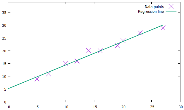
import Data.List (genericLength)
import Graphics.Gnuplot.Simple

varX, varY :: [Double]
varX = [5,  7, 10, 12, 16, 20, 23, 27, 19, 14]
varY = [9, 11, 15, 16, 20, 24, 27, 29, 22, 20]

linearRegression :: [Double] -> [Double] -> (Double,Double)
linearRegression xs ys = (a,b)
    where n     = genericLength xs
          sumX  = sum xs
          sumY  = sum ys
          sumX2 = sum (zipWith (*) xs xs)
          sumY2 = sum (zipWith (*) ys ys)
          sumXY = sum (zipWith (*) xs ys)
          b     = (n*sumXY - sumX*sumY) / (n*sumX2 - sumX^2)
          a     = (sumY - b*sumX) / n

mygraph :: [Double] -> [Double] -> IO ()
mygraph xs ys =
    plotPathsStyle
      [YRange (0,10+mY)]
      [(defaultStyle {plotType = Points,
                      lineSpec = CustomStyle [LineTitle "Data points",
                                              PointType 2,
                                              PointSize 2.5]},
                     zip xs ys),
       (defaultStyle {plotType = Lines,
                      lineSpec = CustomStyle [LineTitle "Regression line",
                                              LineWidth 2]},
                     [(x,a+b*x) | x <- [0..mX]])]
    where (a,b) = linearRegression xs ys
          mX    = maximum xs
          mY    = maximum ys

main = mygraph varX varY
I’d be willing to switch to Haskell for time-series if it had a nice way for handling dates on the x-axis. Even in R, this is a huge pain in the ass and looks terrible. As of now, it seems not — the typical method (via here) seems to be having a list of values on the y-axis, and then using zip [1..] values to make a list of tuples. I’d much rather think in days and months rather than “point #3000”.
Further Possibilities
There’s a really beautiful and elaborate example on Rosetta Code: a Pythagoras tree. However, not only does it fail to work, but every time I try to run it, it makes 1,023 .dat files in my current directory! If anyone else can get it working, I’ll be super-excited, but reader beware.
Since Gnuplot has been around for a while, there are lots of groovy examples that you can try reproducing. As you learn more possible features, you’ll likely ‘graduate’ to the gnuplot library. Moreover, it seems that you can take the .dat file generated by Haskell, and plug it right into gnuplot to configure it on the command line.
A nice exercise to start off with is this brief tutorial on studying functions. The documentation is quite friendly as well, and outlines various customizations such as adjusting the colors, range, or style. Last, ch. 4 of Church’s Learning Haskell Data Analysis uses EasyPlot for financial time-series.
Conclusion
In and of itself, EasyPlot isn’t too special, but once the installation is done it’s quite easy to integrate with anything else you’re doing in Haskell. I expect it can be very helpful in studying empirical data to look for outliers, or as an accessible learning aid for calculus (especially multivariable calculus).
Its main flaw is its limited features, but this is solved by Gnuplots, which I haven’t had a chance to try out yet in detail. I also came across Hatlab, likewise based on gnuplot but with very different syntax. Last, I’ve heard good things about Chart, and hope to experiment with it in a future post.
Overall, I’d take this over a fugly Excel chart any day.