
My interest in data visualization comes in part from the idea that far before explicitly formalizing a model, we begin with some sort of picture, however simplistic — complete with fuzzy parts, or vague spatial metaphors for how one thing affects another (often literal handwaving). Yet, once we actively spell out an idea through shapes, colors, and relative positions, we see just how much information we can pack into this one concept: its ‘degrees of freedom’.
On @deepchimera’s recommendation, I came to discover the data visualizations of Giorgia Lupi. In her book Dear Data, she and a coauthor send postcards with elaborate graphs about some feature of their past week. My favorite part was following along and tracing out in my head how I might replicate each graph in code. I’ve gotten some flack for making diagrams in TikZ rather than using a staple like Tableau, but non-standard diagrammatics is where TikZ really shines.
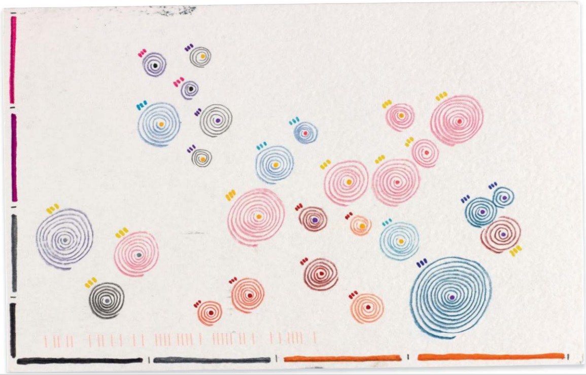
For this graph, the author recorded her feelings of envy. Here is the original, minus the legend:
And here is my reproduction (pdf here):
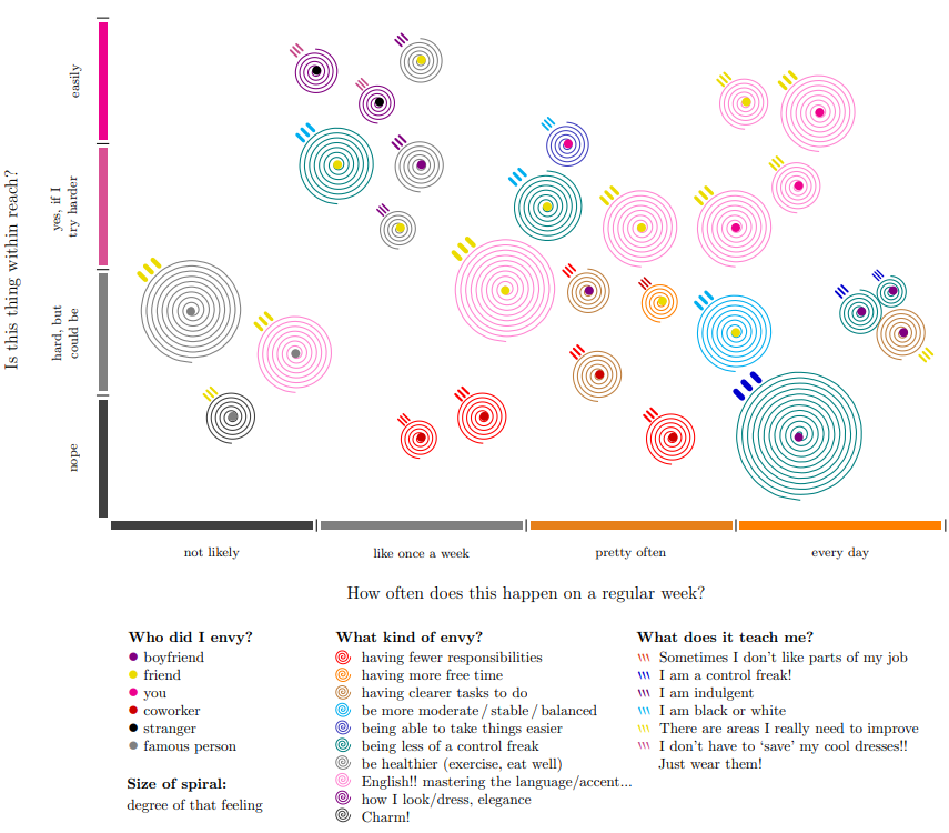
My TikZ code is available here, so anyone who wants can make their own version. The biggest pain is that your topics of envy will differ from the author’s, so you’ll have to choose new colors and labels.
Beyond that, the main data points you will need are the following:- Person being envied — either specific (you), or a category (coworker)
- Thing being envied — highly idiosyncratic, but nice for showing recurring themes
- Lesson learned from it — often slightly redundant, but still interesting
- Degree of this feeling of envy (continuous scale from 1.5 to 5; smaller than 1.5 looks bad)
- Weekly frequency of coveting this thing (continuous scale from 1 to 20)
- How attainable the coveted thing is (continuous scale from 1 to 12)
What I mean by ‘continuous scale’ is that it can include decimals, like 5.25. So if it’s easier, scales from 1 to 10 are fine, and you can normalize it afterwards (multiply by 2 or 1.2). Both 20 and 12 are multiples of 4; this way, with 4 levels for frequency and attainability, they fit on a grid (not shown).
The spirals are mostly an artistic flourish (circles would be fine), but give it style. I like how the x-axis focuses on frequency rather than order. The most creative part is the y-axis (attainability), which makes the graph far more poignant. In the bottom-left quadrant, the author fleetingly covets some feature of a celebrity who she can never measure up to. In the top-left quadrant (note the leftmost whitespace), she sees a nice article of clothing that she could just buy herself. The bottom-right is largely dissatisfaction with her personality, and the top-right is mainly her English.
I thought of a few possible variations to make the chart even more elaborate, if desired.-
Angle for the line where the spiral begins — just change
rotate=-90to any angle you want - The tick marks can also have any angle — maybe for the degree of insight from one’s lesson
- Archimedean spirals for envy (coveting), and logarithmic spirals for jealousy (fear of loss)
- Dots can have different sizes, or even be a pie chart (percent of people who elicit this feeling)
I’m too shy to do my own version, but if anyone else is brave enough, give me a shout and I’ll post it!